2019 septa Ridership Data
Published in September 2021
Philadelphia's transit agency septa Southeastern Pennsylvania Transportation Authority. publishes yearly line-by-line breakdowns of ridership and revenue stats Full statistics for each route were previously published at http://septa.org/strategic-plan/reports.html though that page has since been removed. It's still avaliable on archive.org. which we can take and get a sense of how septa operates.
For every bus, trolley, and train, septa has the following operating statistics for fiscal year 2019:
- One way route miles (avg) The averge distance of a route
- Daily average (wk) ridership Average number of rides on a weekday
- Vehicle hours (annual) Total operating hours for all verhicles on this route during the year
- Vehicle miles (annual) Total miles moved for all vehicles on this route during the year
- Peak vehicles At the busiest scheduled period the maximum number of vehicles in service
- Fully allocated expenses Total cost to operate this route during the year
- Passenger revenue Estimated total revenue generated by this route during the year
- Operating Ratio How much revenue covered expenses (as a percent) for this route
- Mode Kind of transportation vehicle (bus, trolley, etc.)
- Vehicle size Number of train cars, or lenght of bus
What Are The Most Popular Lines
Using this data we can look at all routes with at least 10,000 weekday average riders:
| Rank | Route | Vehicle Type | Average Weekday Riders | % Change from 2018 | |
|---|---|---|---|---|---|
| 1 | Market Frankford Line | Subway | -0.9% | 🠖 | |
| 2 | Broad Street Line | Subway | 0.6% | 🠖 | |
| 3 | Paoli/Thorndale | Rail | 6.9% | 🠖 | |
| 4 | 47 | Bus 40' | 8.6% | 🠖 | |
| 5 | 18 | Bus 60' | -5.2% | 🠖 | |
| 6 | Lansdale/Doylestown | Rail | 4.6% | 🠖 | |
| 7 | G | Bus 40' | -7.5% | 🠖 | |
| 8 | 23 | Bus 40' | -2.2% | 🠖 | |
| 9 | 52 | Bus 40' | -6.2% | 🠖 | |
| 10 | 13 | Trolley | 2.6% | 🠖 | |
| 11 | 11 | Trolley | 0.6% | 🠖 | |
| 12 | 34 | Trolley | 0.1% | 🠖 | |
| 13 | 36 | Trolley | -5.8% | 🠖 | |
| 14 | 33 | Bus 60' | -6.2% | 🠖 | |
| 15 | 10 | Trolley | 1.5% | 🠖 | |
| 16 | Media/Elwyn | Rail | 0.2% | 🠖 | |
| 17 | Trenton | Rail | -6.5% | 🠖 | |
| 18 | R | Bus 40' | 15.3% | 🠖 | |
| 19 | NHSL | Rail | 3.5% | 🠖 | |
| 20 | 56 | Bus 60' | -7.0% | 🠖 | |
| 21 | West Trenton | Rail | -5.5% | 🠖 | |
| 22 | 26 | Bus 40' | -5.2% | 🠖 | |
| 23 | 21 | Bus 40' | 32.1% | 🠖 | |
| 24 | 60 | Bus 60' | -12.3% | 🠖 | |
| 25 | 17 | Bus 60' | -8.2% | 🠖 | |
| 26 | 66 | Trackless Trolley | -2.9% | 🠖 |
One thing that really strikes me is just how many more people the two subway I'm just going to say "subway" to refer to both the MFL and BSL for convienence lines carry compared to anything else in the system!
Median Ridership By Vehicle Type
| Vehicle Type | Median Weekday Riders | % Change from 2018 |
|---|---|---|
| Subway | 145,613 | -0.1% |
| Trolley | 11,717 | 0.4% |
| Rail | 9,917 | -2.6% |
| Trackless Trolley | 4,425 | -4.2% |
| Bus | 2,503 | -5.3% |
A typical single bus line in the septa system moves about 2,500 people a day, while a subway line can move over 100,000 daily.
Though there are a lot of buses, and only two subway lines. Comparing the totals instead:
Total Ridership By Vehicle Type
| Vehicle Type | Total Weekday Riders | Number Of Routes |
|---|---|---|
| Bus | 473,494 | 125 |
| Subway | 291,227 | 2 |
| Rail | 131,115 | 14 |
| Trolley | 79,037 | 8 |
| Trackless Trolley | 17,828 | 3 |
| Total: | 992,701 | 152 |
Out of the almost one million riders a day, nearly half are moved by a Bus.
Ridership Change
Most of the lines seemed to have a small decrease in ridership, though a couple had massive gains. If we take the total ridership numbers between 2019 and 2018 we can make a histogram of the changes

Biggest Ridership Loss
| Route | Vehicle Type | Change since 2018 [count] | [%] |
|---|---|---|---|
| 42 | Bus | -2,245 | -31.6 % |
| 14 | Bus | -2,010 | -20.5 % |
| Market Frankford Line | Subway | -1,610 | -0.9 % |
| 60 | Bus | -1,270 | -12.3 % |
| G | Bus | -1,057 | -7.5 % |
| 17 | Bus | -836 | -8.2 % |
| 18 | Bus | -834 | -5.2 % |
| L | Bus | -823 | -12.0 % |
| 52 | Bus | -821 | -6.2 % |
| 56 | Bus | -761 | -7.0 % |
Biggest Ridership Gains
| Route | Vehicle Type | Change since 2018 [count] | [%] |
|---|---|---|---|
| 15 | Trolley | +4,065 | 49.8 % |
| 21 | Bus | +3,324 | 32.1 % |
| R | Bus | +1,688 | 15.3 % |
| Paoli/Thorndale | Rail | +1,446 | 6.9 % |
| 47 | Bus | +1,421 | 8.6 % |
| 113 | Bus | +1,015 | 13.6 % |
| XH | Bus | +950 | 19.6 % |
| Lansdale/Doylestown | Rail | +736 | 4.6 % |
| Broad Street Line | Subway | +673 | 0.6 % |
| 107 | Bus | +598 | 43.9 % |
Costs
There is also some interesting data around both revenue and total expenses per route, so we can look at the cost to run a route compared to how much money it makes from fares.
On the whole, septa only makes about a third of its expenses from passenger revenue (fares)
From septa's FY 2019 Operating Budget:
Passenger Revenue: $470.5 Million
Total Expenses: $1,453 Million
Overall Operating Ratio: 32.4%
Operating Deficit (before subsity): $942.6 Million. But some lines are more profitable than others.
In general both costs and revenue scale with how many people ride a route. The busier it is, the more vehicles have to be deployed, with more operators, and more maintenance needed. Here we can see how it scales up.

But notice that mode matters. Here the regional rail (blue) costs are sigificantly higher than the bus (red) baseline.
However in 2019 septa had a entierly different fare structure for regional rail than for busses or trollies. The rail system was zoned so longer trips cost more. If instead we look at the operating ratio—i.e., how much money a line makes compared to its cost—we see that the mode split goes away, and that there is much less of a correlation with ridership.

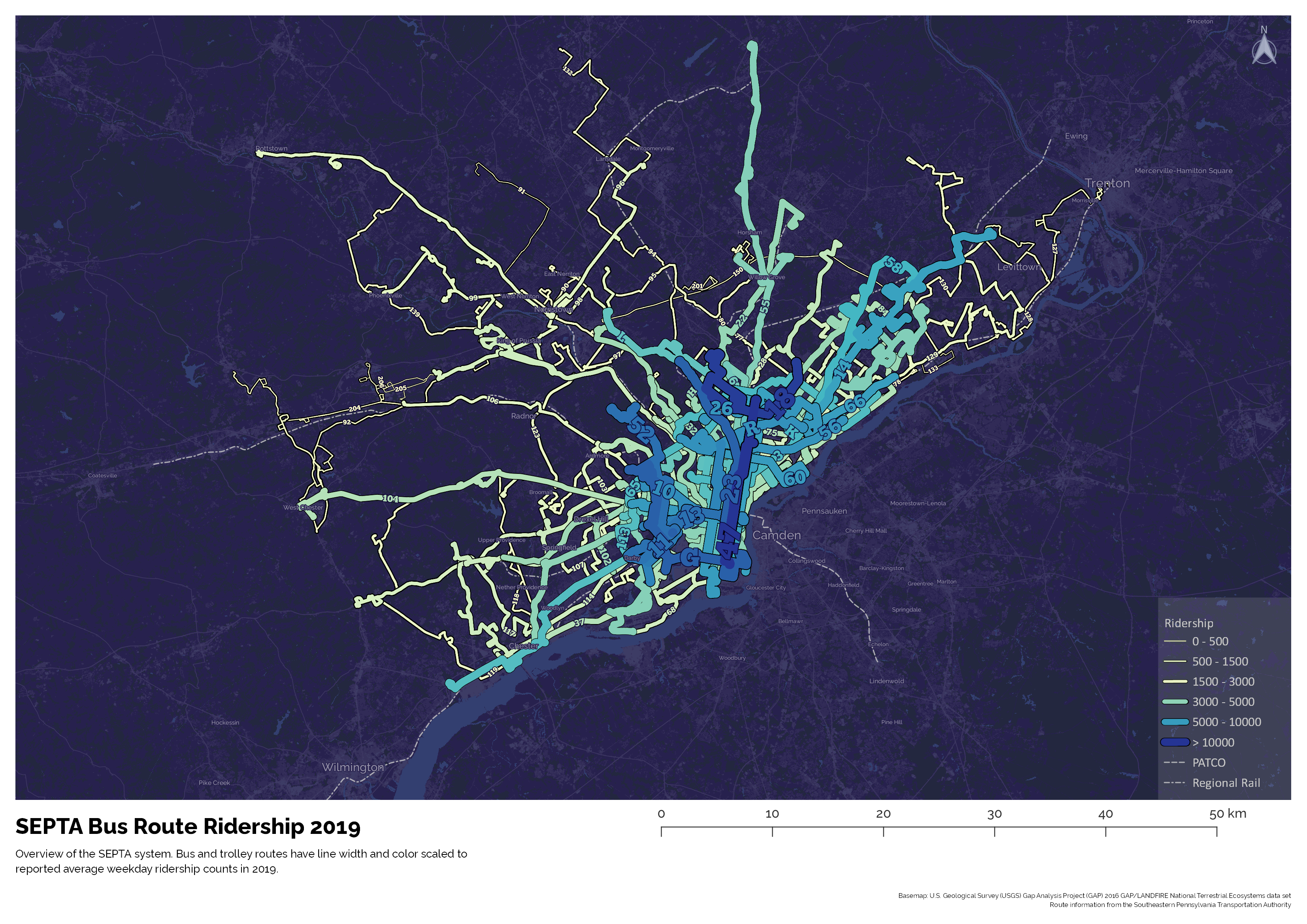
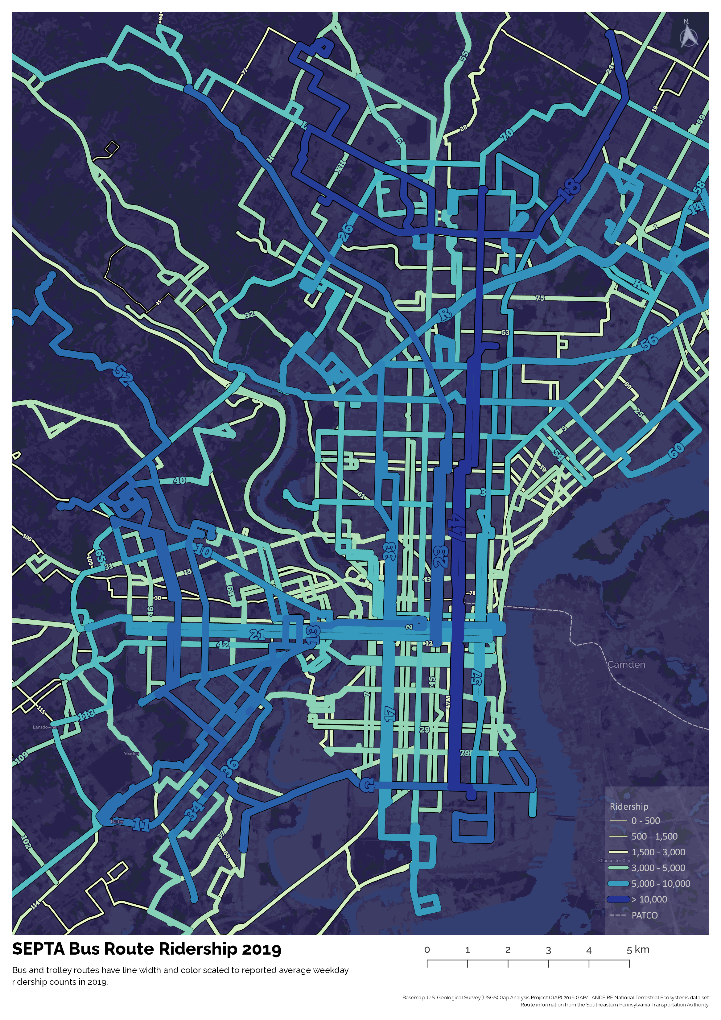
Maps
With ridership data we can make a map of the system, but drawn with line widths and colors scaled to the ridership numbers.
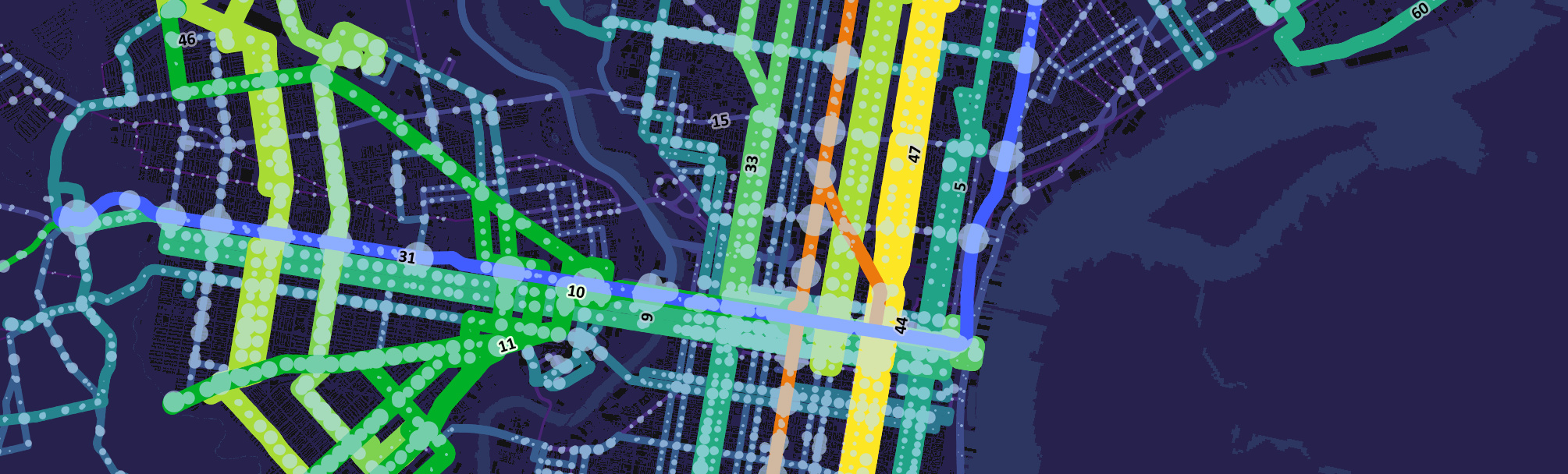
Zooming into just the core of Philadelphia
We can also see if there is a geographic component to the change in ridership numbers.
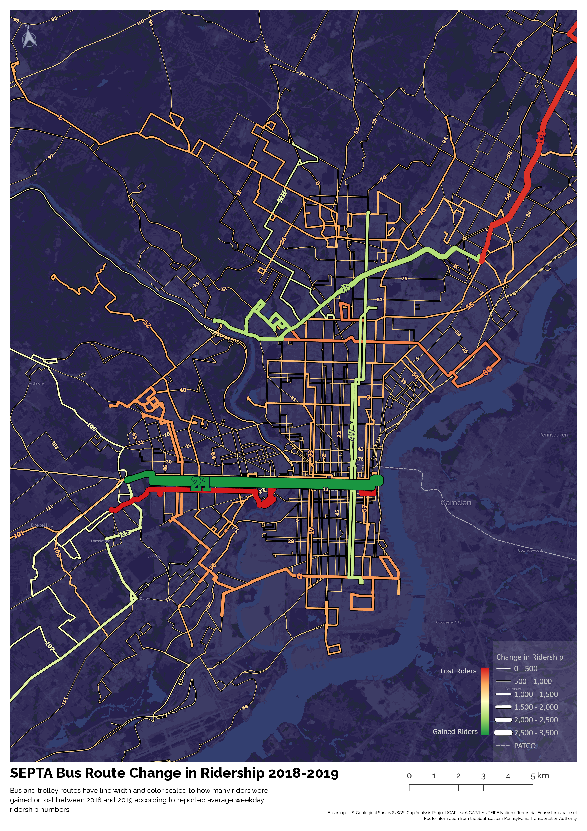
It's hard to see any one particular region that gains riders more than another. West Philly might be a touch more green, but the most popular lines are the ones that we might expect (lines that connect with center city or with major transportation centers).
Raw Data
Download a csv of the 2019 data used in the post: